Originally posted by 4EyedTurd
View Post
Announcement
Collapse
No announcement yet.
Just thinking out loud
Collapse
X
-
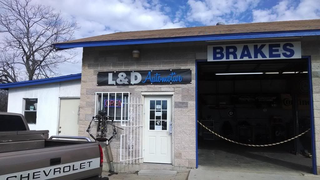
Well this is what I went with. Got it in vinyl to see if I like it and I can have them duplicate it in metal. Still undecided.Originally posted by BLAKE View PostThe chrome effect is a bit much for signage, but the typography in general has a lot more personality than the other. Have the sign shop replicate that and pick your colors and stick with them. If you're tied to the blue on the building, use it and/or something complimentary for your sign and any other advertising materials. I'd be tempted to use that medium blue with a lighter blue and orange (think Gulf racing livery). That would really stand out among the colors that most shops use.
 Good judgment comes from bad decisions and a lot of that comes from bad judgment.
Comment
Comment